Case study · Website design process
From brief to handoff.
Every stage of one corporate website, in the order the work happens: brief, sitemap, wireframes, visual design, desktop, tablet and mobile layouts, a component kit and the developer handoff. The project is Northpeak Capital, a private-equity firm. Its prototype is real, responsive HTML you can open.
Who is this page for?
Before any layout: who arrives, what they need to find, and what they should do next. Every later decision is checked against these three cards.
Three readers, one page
- Founders choosing a long-term partner
- Investors checking track record and reports
- Senior hires and advisors
Trust in ten seconds
- State the investment thesis above the fold
- Prove scale with four hard numbers
- Let founders speak, not only the firm
Three routes out of the hero
- Our approach (founders)
- View portfolio (everyone)
- Investor login (in the nav, always visible)
Six pages, one clear path
The sitemap is agreed before design, so the home page only has to introduce each page, not replace it. Below it, the home page section order: each block answers the question the previous one raises.
- NavigationFive pages + Investor login
- HeroThe thesis in one sentence, two routes
- Key figures€2.4bn · 31 · 7.2 yrs · 2009
- ApproachThree pillars, numbered I–III
- PortfolioFive companies as a table, link to all 31
- Founder quoteProof in a client’s voice
- InsightsThree latest pieces
- FooterOffices, links, regulatory
Structure first, style later
Grey boxes for layout, real headlines for hierarchy. The client signs off structure here, when changes are cheap. Switch to Final to see the same page after visual design: the layout survives, only the styling changes.
Scroll inside each frame
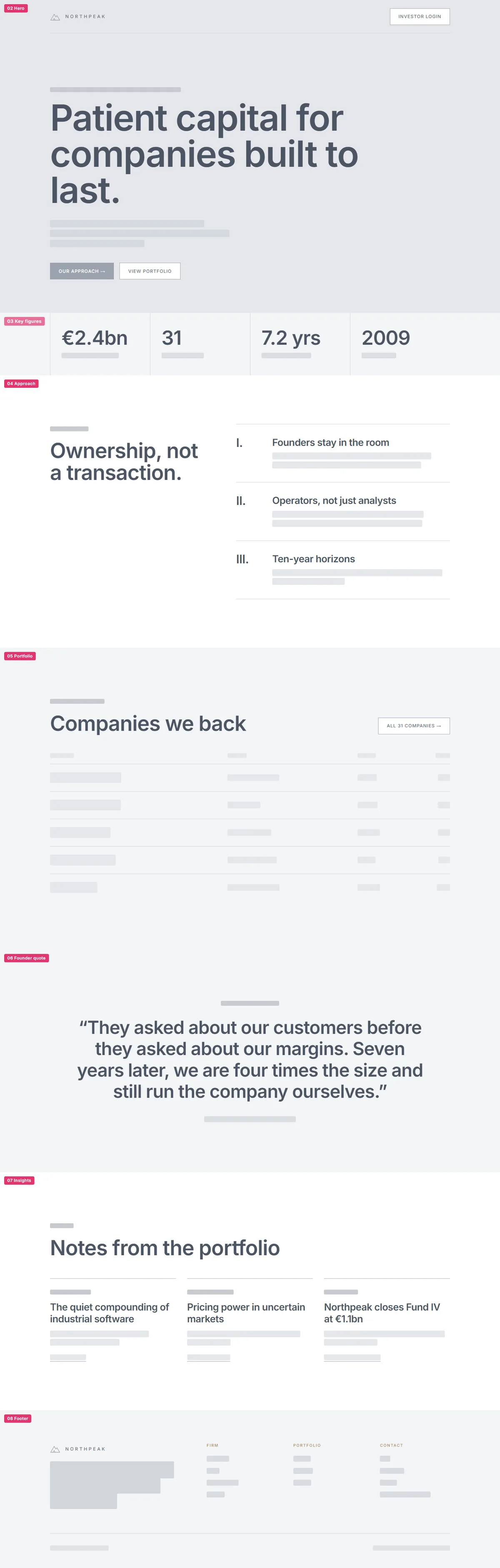
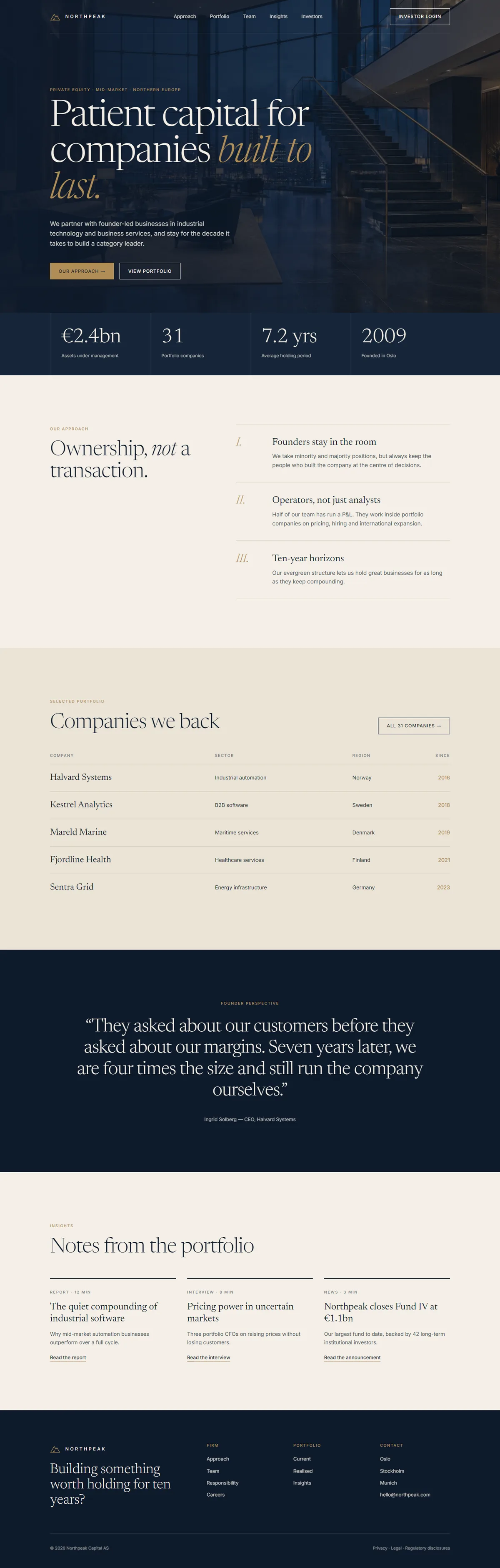
Desktop · 12 columns · 1280 max width


Mobile · 390 · one column
Quiet money, warm light
One page of rules signed off before the full layout: an editorial serif for conviction, a plain sans for facts, navy and ivory for calm, brass used only where the eye should land.
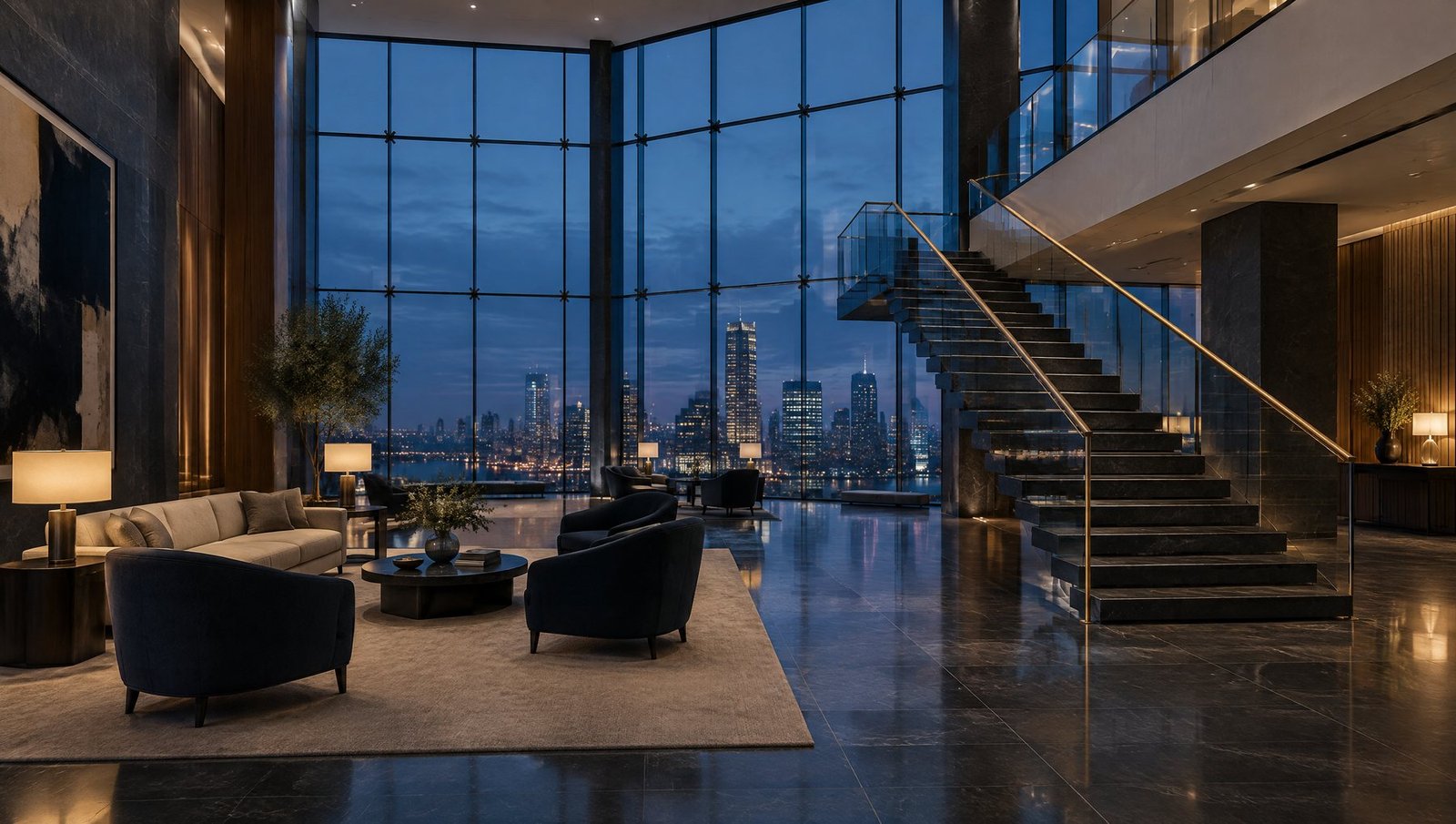 Hero direction
Dark photography at 55% under a navy gradient, so white type holds AA contrast on any crop.
104 / 104Newsreader 300
60 / 63Section heading
28 / 34Founders stay in the room
16 / 26Inter 400 for every fact, figure and paragraph.
11 · +18%Private equity · Mid-market
Four widths, one hierarchy
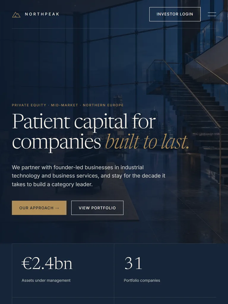
Designed at 1440, checked at 1024 and 768, finished at 390. The reading order never changes; columns, type size and navigation do. Every change is written down for the developer.
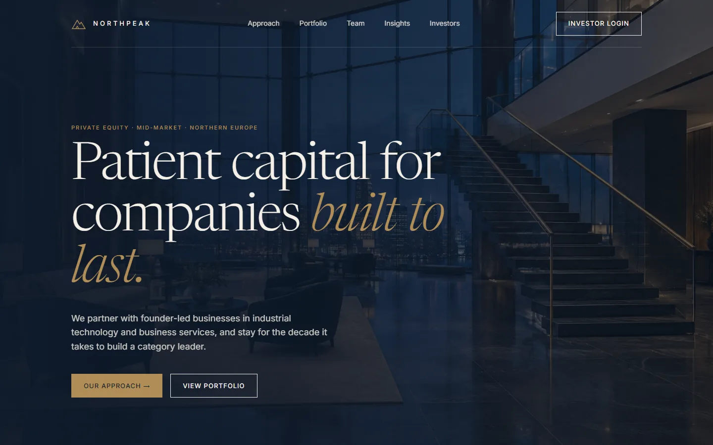
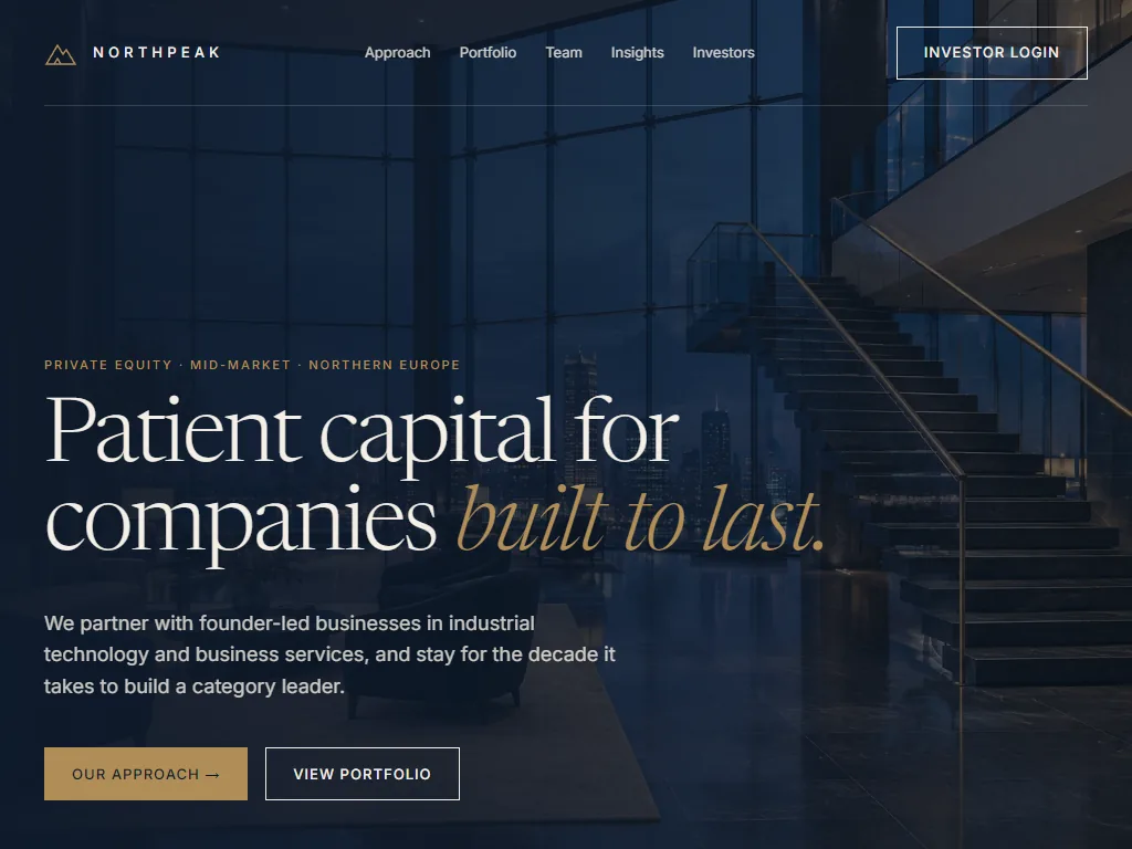

Final desktop layout
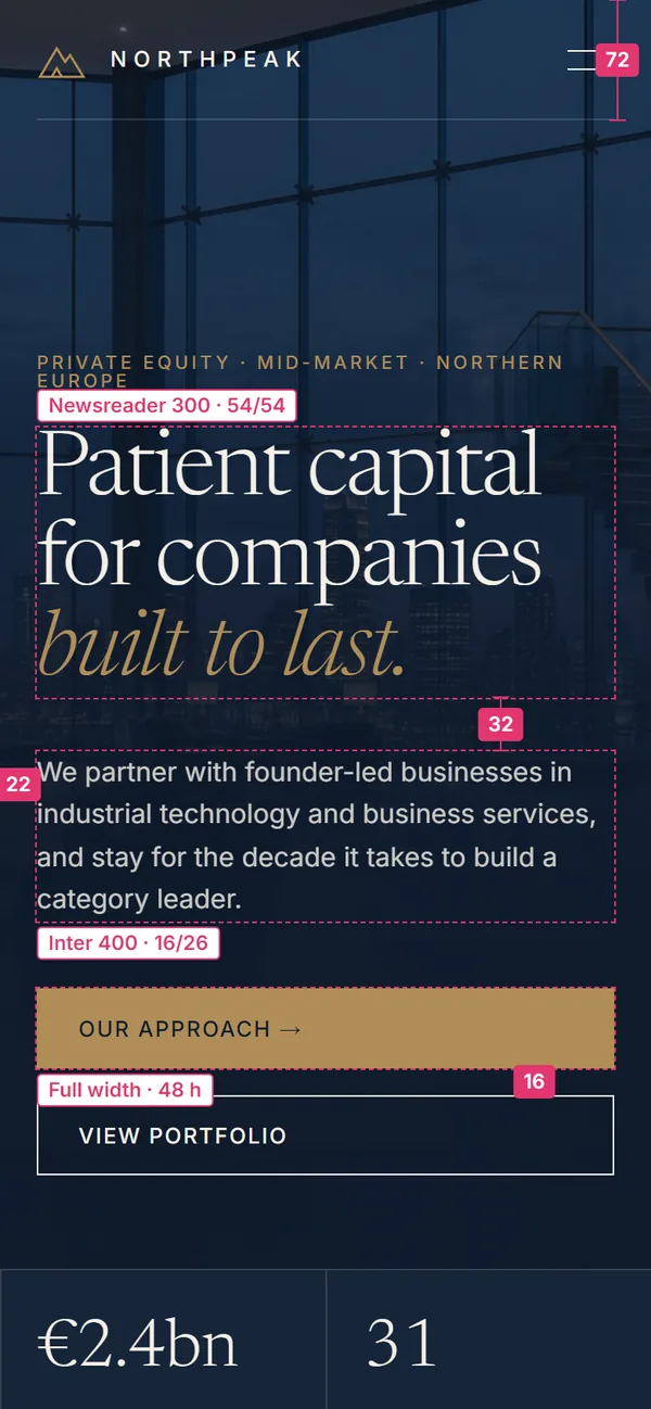
Final mobile layout
| Element | Desktop ≥1101 | Tablet 701–1100 | Mobile ≤700 |
|---|---|---|---|
| Navigation | 5 links + login | Links ≤900 → menu | Logo + menu, 72 h |
| Hero headline | 104 / 104 | 80 → 68 | 54 |
| Hero buttons | Side by side | Side by side | Stacked, full width |
| Key figures | 4 columns | 4 → 2 columns | 2 columns |
| Approach | 5 / 7 split | Split → stacked ≤900 | Stacked |
| Portfolio table | 4 columns | 4 columns | Company + year only |
| Insights | 3 cards | 3 → 2 + 1 | 1 per row |
| Side margin | 64 | 40 | 22 |
Built once, reused everywhere
The page is assembled from nine components with their states. The inner pages (portfolio, team, insights) reuse the same kit, so they cost less to design and less to build.
Founders stay in the room
Founders stay at the centre of every decision.
“They asked about our customers before our margins.”
Ingrid Solberg · CEO, Halvard SystemsNothing left to guess
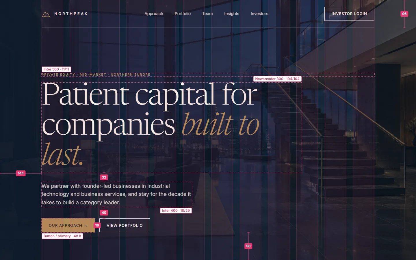
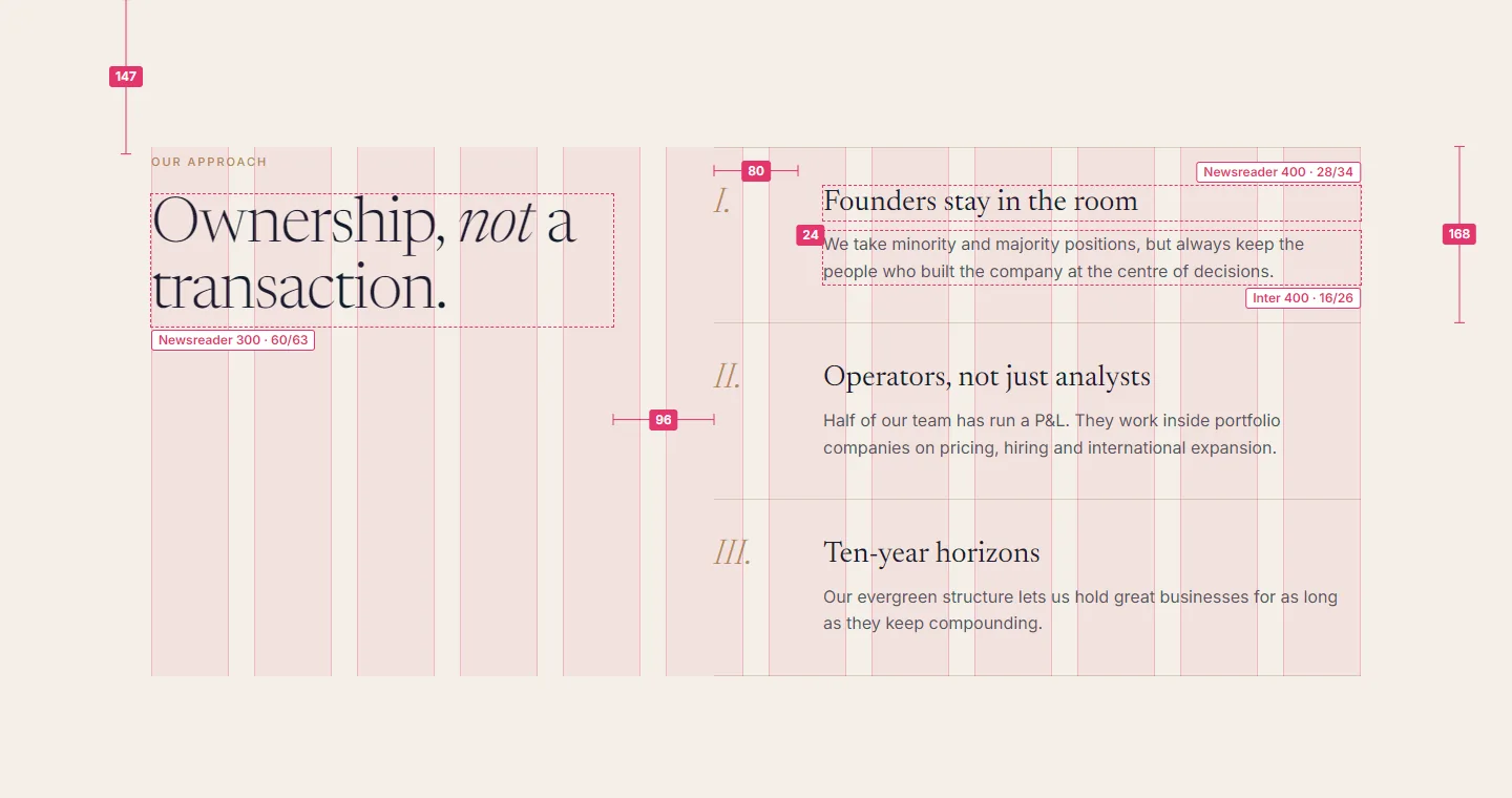
Redlines measured from the built prototype, design tokens as code, a file organised by page, exported assets and a QA pass on real devices after the build. Click a redline to enlarge it.
- Design file · pages
- 00 Cover & changelogv1.4
- 01 Sitemap & flows6 pages
- 02 WireframesD + M
- 03 Style tile1
- 04 Desktop 14406 frames
- 05 Tablet 7686 frames
- 06 Mobile 3906 frames
- 07 Components9 + states
- 08 Prototypeclickable
- 09 Dev handoffspecs
/* northpeak-tokens.css · excerpt */
:root {
  --np-navy: #0E1A2B;
  --np-ivory: #F4EFE6;
  --np-brass: #B08D57;
  --np-display: 300 104px/1 Newsreader; /* 80 · 54 */
  --np-h2: 300 60px/1.05 Newsreader; /* 50 · 40 */
  --np-body: 400 16px/1.6 Inter;
  --np-max: 1280px;
  --np-gutter: 64px; /* 40 · 22 */
  --np-section: 140px; /* 110 · 80 */
  --np-button-h: 48px;
}
What the developer receives
- Specs for every frame, inspectable in the file
- Tokens: colour, type, spacing, layout, as CSS
- Breakpoint table with every change listed
- Assets: hero 2880 px WebP + JPG, logo SVG, favicon set
- States: hover, focus (2 px brass), active, empty
- QA pass on the built site at all four widths
Your site, through the same six steps.
Brief to handoff in about five working days for a corporate home page and its templates. Figma, Webflow, WordPress or hand-built HTML.